Redesigning the current Instagram feed to create meaningful content consumption

PROJECT BACKGROUND

As an avid Instagram user, I've found that there is some friction with the current Instagram feed. A lot of users have expressed they aren't getting a lot of value through the app due to a lack of meaningful personalized content shown on our feeds. I also would like to note that I don’t work for Instagram and I did not seek or reference internal information, tools, or explorations for this project.

TEAM

Marriam Mir (just me)

ROLE

UX Designer

RESPONSIBILITIES

User Research, Ideation, Concept Development, Wireframing

TOOLS

Figma, Pen & Paper

Project Overview

THE PROBLEM

Instagram's value through content consumption is declining due to users expressing not viewing meaningful content on their feed.

THE SOLUTION

A feature that allows users to create personalized feeds based on viewing content that aligns with them. This will...

01. Give users a sense of control by allowing straightforward consumption
02. Allow flexibility and personalization in organizing user feeds at different times
03. Ensure users are caught up with content they care about

THE PROCESS

I began by dividing the project into 7 phases. I developed a project timeline over 3 days to stay on track and find a solution within a strict time constraint.

Understand & Research

SECONDARY RESEARCH

To dig deeper, I began looking at App Store reviews and Reddit groups to understand how other people viewed this issue. I scanned for the ones marked as “most helpful” and with a high amount of upvotes which showed that many users agreed with the review or comment. To understand different perspectives I looked out for opposing views of people who liked the current feed.
There were A LOT of differing opinions on this topic, but after doing some digging I gathered the following insights:

SURVEYS & INTERVIEWS

After having a general understanding of current frustrations I surveyed 20 Instagram users and conducted 5 user interviews via phone call and Zoom to get a better understanding of:

Problem Definition

AFFINITY MAP

I externalized and consolidated all the information I gathered from my surveys and interviews. I organized the insights based on common themes/topics that occurred.

Opportunity Discovery

GENERATING HOW MIGHT WE STATEMENTS

After identifying research insights through affinity diagramming, I reframed the problem statements into ‘How Might We’ statements to address areas of opportunity. After identifying 6 areas of opportunity, I defined my singular design opportunity and 3 additional design goals to guide the solution I come up with.

OPPORTUNITY DEFINED

How might we design a more organized feed for users to ensure meaningful content consumption?

WHY THIS OPPORTUNITY?

I settled on this opportunity because based on my research findings, most users scroll through their feed regularly rather than other in-app content consumption features such as reels or the explore page. I gathered that what one person wants from their Instagram experience is different from the next, as the app caters to a variety of user types. The value of Instagram towards its users lies in ensuring they are consuming content that is relevant and personalized to their app use case so they can get the most out of their experience. Addressing the possibility of controlled content consumption through feeds gives users a friendly experience, and improves user retention.  


OTHER DESIGN GOALS

01. Give users a sense of control by allowing straightforward consumption
02. Allow flexibility and personalization in organizing user feeds at different times
03. Ensure users are caught up with content they actually care about


Ideation

APP MAP

I created a high-level app map to better understand the app as a whole and visualize potential entry points of feature integration with the already existing Instagram app.

WIDE IDEATION 

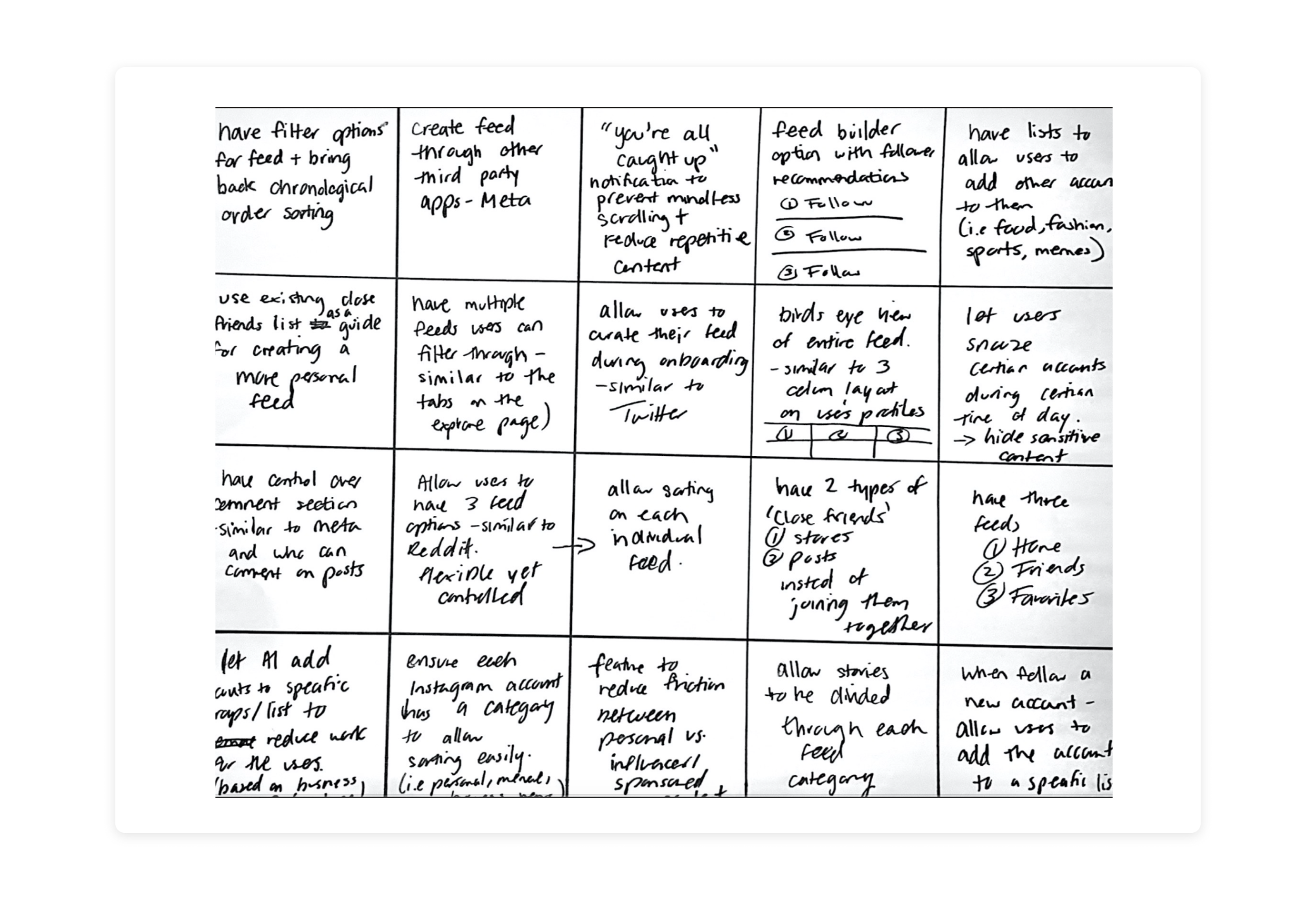
Next, I engaged in a wide ideation sketch session to broaden the scope and develop a large quality of ideas I could be inspired by going forward.

SKETCHES

I narrowed down my design to a few concepts I wanted to explore further. I developed these ideas into sketches to better form ideas and settle on which concepts I should move forward with. I chose the concept of allowing users to curate their feeds. I restricted feed options to 3 to prevent users from experiencing the paradox of choice while allowing users to have control over some feed personalization.

Concept Development

MEDIUM-FIDELITY WIREFRAMES

I developed the concepts into medium fidelity wireframes to ensure the layout and interaction patterns aligned with Instagram’s Design system and the layout aligned with the goals of improving the personalization of feeds.

Concept Refinement

FINAL DESIGN

I developed high-quality prototypes that demonstrate the new feed personalization feature. This new experience gives users control of their content consumption to cater to their Instagram use case and allow more meaningful content consumption. Below are prototypes of the new features.


Personalization of a user’s feed starts as soon as a new user onboards the app. As soon as they open their feed they can connect their Facebook account, connect with contacts, and select their interests. From there the AI generates a list of suggested accounts to follow. This gives users a sense of control over their content consumption.
Users can create up to 3 feeds. They can select a name for their new feed and the AI suggests accounts to follow based on their close friends list, interests, and most engaged with accounts. The option is given to manually search for accounts or add through their suggestions. This gives users a sense of control over their content consumption.
Through each feed, users can sort their feed to view content based on the preference which includes chronological, older posts, or by default. This allows users to make sure they are all caught up with the content they care about. They can also snooze certain accounts for a certain period if they don't want to view their content without unfollowing.

Reflect & Grow

01. Learning what works for me

One of the best things about the design process is that you come to curate your own. You learn what works for you, and what doesn't. You learn to do things faster, better, and more efficiently every time you take on a new project. This time setting a tight time constraint of 3 days allowed me to prioritize certain aspects of the design process such as user research and ideation to truly understand the problem and focus on concept development.

02. Don't design in a bubble

When designing an experience that serves a wide variety of users, everyone has a different experience. The way one person interacts with Instagram differs from the next person, and the next. Allowing users to have some flexibility and personalization is a crucial aspect of creating an experience that gives them value.

03. Diving into user-testing

The next step of this project is to dive into some user-testing. I'm curious to see the gaps with my proposed solution and see if people can easily navigate through the experience. If this feature were to exist, some metrics of success could be analyzed through increased user engagement and other metrics to measure performance since most users felt their content wasn't being reached and viewed by others such as close friends.

💖 If you're all the way down here already, thank you so much for taking the time out of your day to live this journey with me! 

View other work

Let's connect!

Want to collaborate? Curious about my experience?
Just want to say hi? I'm always open to chatting via:

© Marriam Mir 2024.  All rights reserved.